Hino to revise its corporate logo for the first time in 32 years -To evolve our expression of a changing Hino with an unchanging concept-
Management
Mar 26, 2026
Hino Motors, Ltd. (Head office: Hino, Tokyo; President: Satoshi Ogiso. Hereinafter "Hino") will revise its corporate identity logo (hereinafter referred to as the "corporate logo") on April 1st. Our current corporate logo was established in 1994, and this will be the first revision in 32 years.
The commercial vehicle industry landscape is undergoing rapid change, faced with the growing need to implement CASE technologies, digitalization, and globalization.
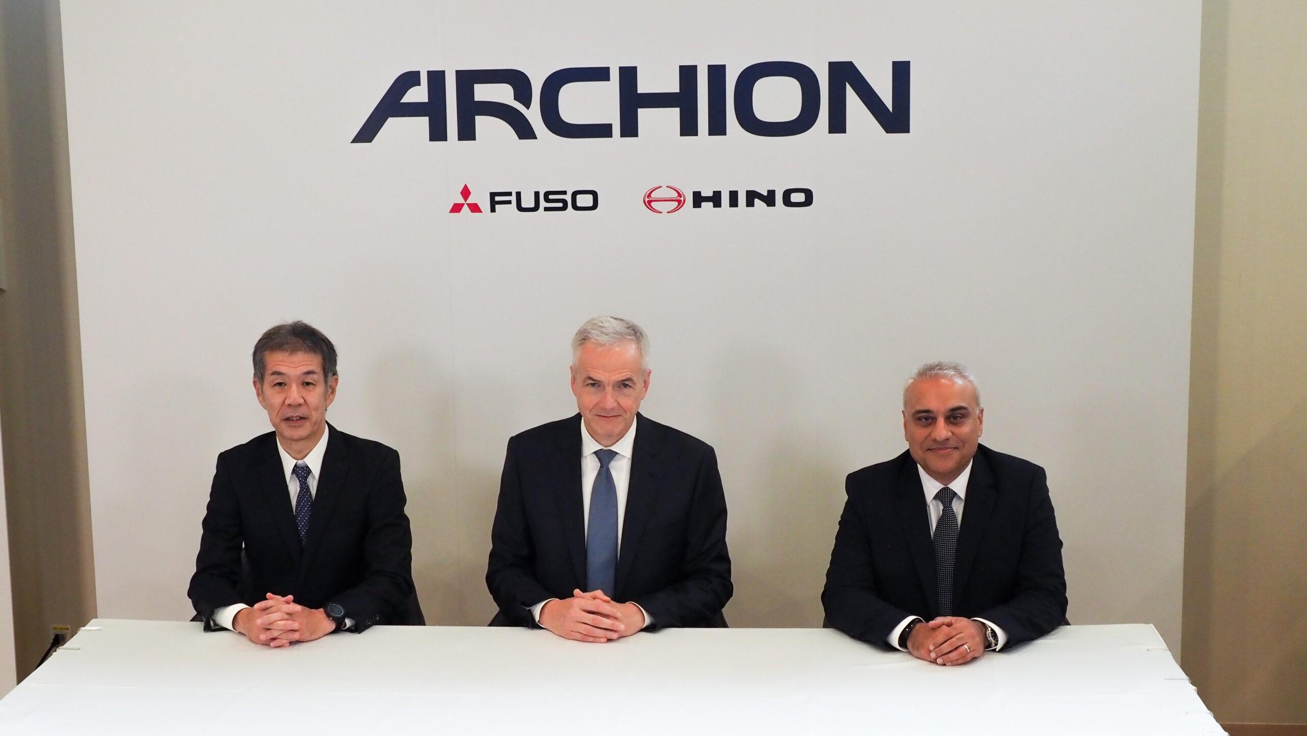
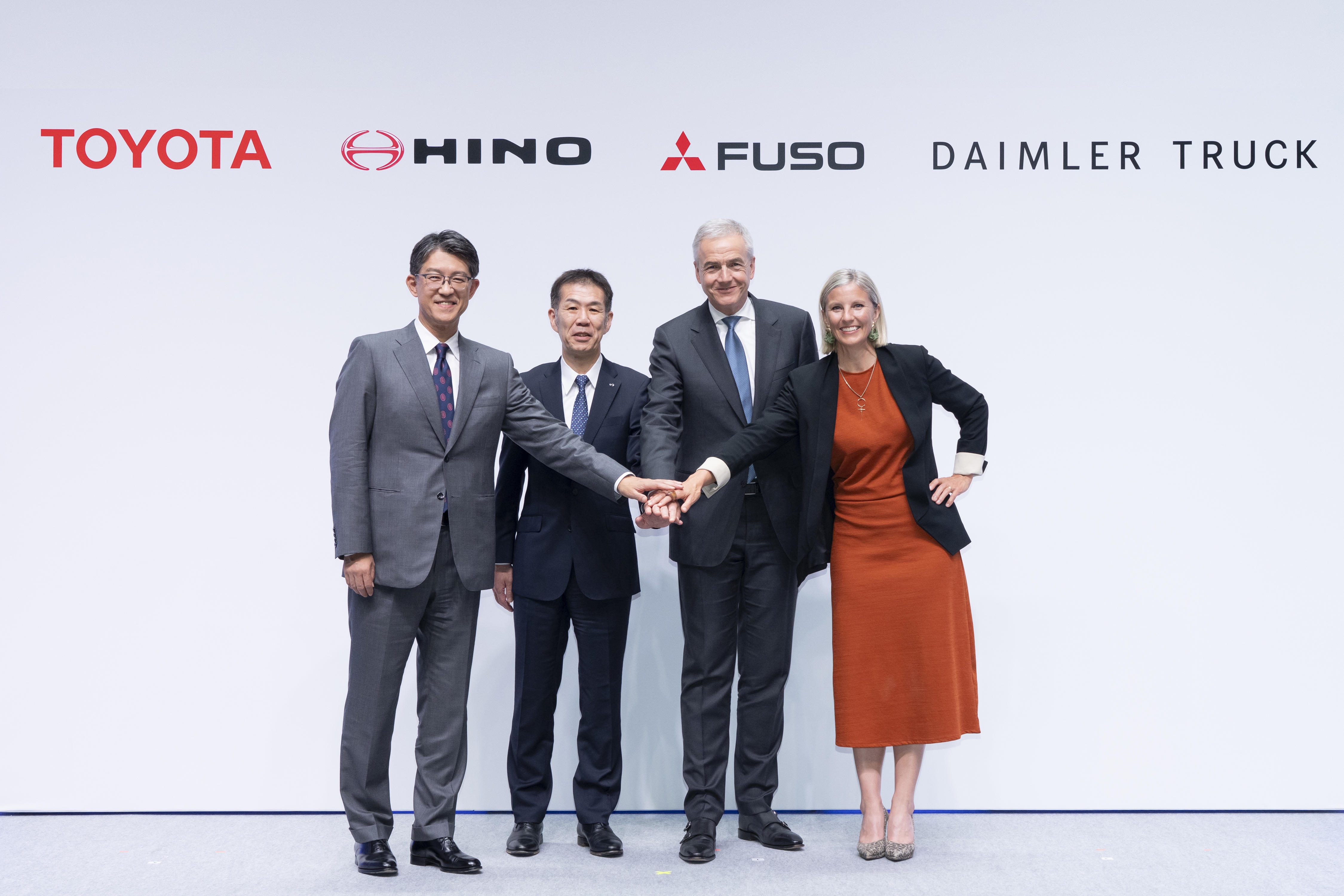
Amidst this changing landscape, Hino will undergo significant changes starting April 1st. We will be marking a historic turning point with the appointment of our new CEO and becoming a part of the ARCHION Group.
To ensure that Hino continues to stand by its stakeholders as an "unwavering partner," the new corporate logo inherits its previous concept while evolving its expression. This revision will improve visibility and readability, ensuring that it leaves a strong impression of Hino with our many stakeholders, including in digital environments such as social media.
New corporate logo
■ Corporate logo concept (inherited values)
Hino's corporate logo, which we have been using since 1994, is based on the letter "H" from "HINO" and embodies the following values:
・The sun rising above the horizon → Our will to "take on challenges"
・A form pulling in two directions → Harmony between high technology and the environment, and a leap forward into the future
・Arrows pointing left and right → Operating trucks and buses safely
・Curves on the left and righ → Integrated distribution connecting trunk lines and end points
■ Concept video "Hino Motors | The meaning behind the corporate logo" (approximately 25 seconds)
■ Regarding the new corporate logo
The subtle embellishments that represent reflections were removed to create a clearer design for better visibility and readability.
Where we have previously used several different logos, we will unify them into a single design to make the Hino brand more easily recognizable to our stakeholders.
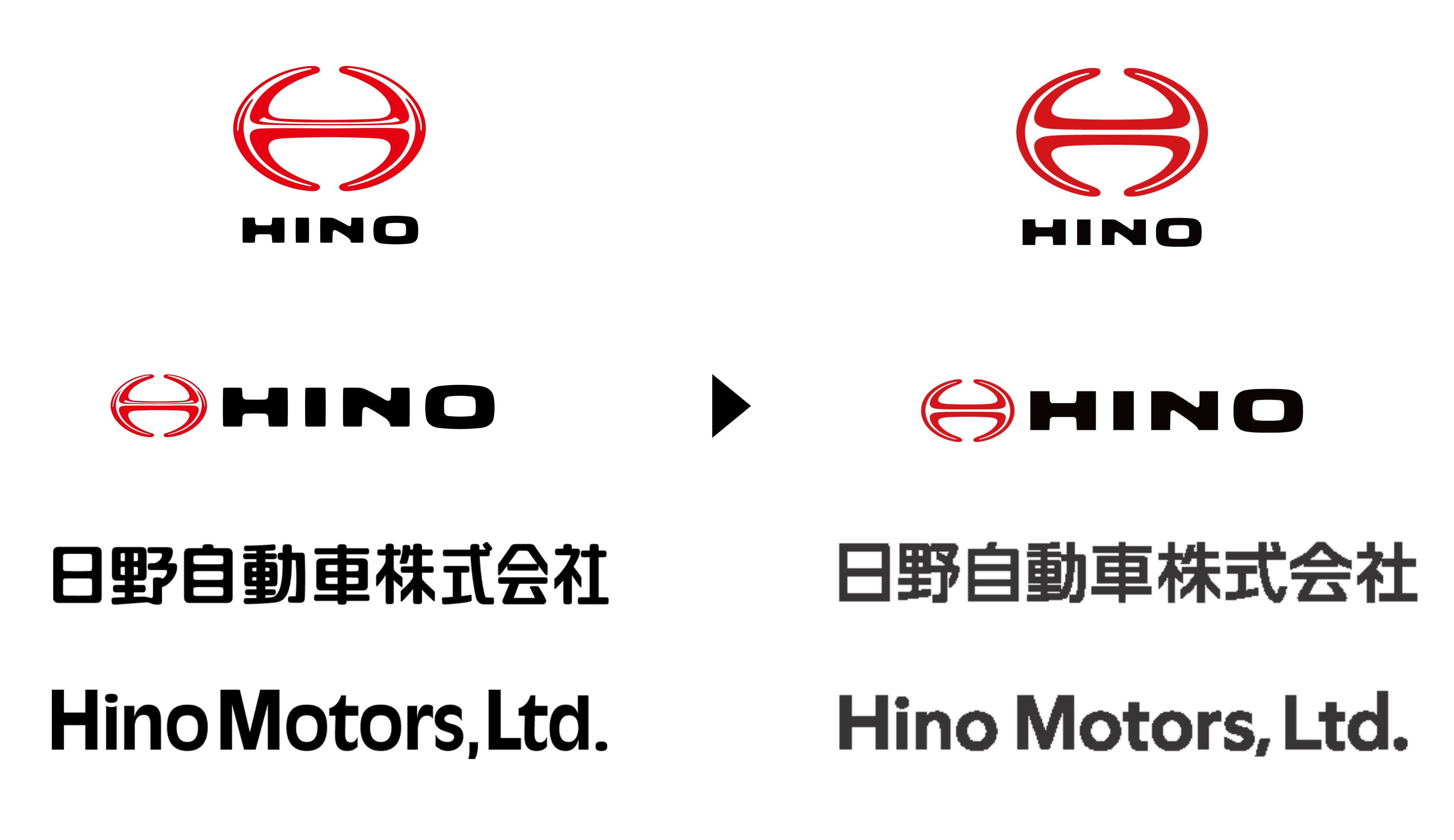
Left: Current logo Right: New logo
■ Brand color
Our business signage, PowerPoint template and other items will feature designs that further emphasize HINO Red, Hino's brand color. ARCHION also uses red as its brand color, so using a consistent color scheme will express a sense of unity for the group.
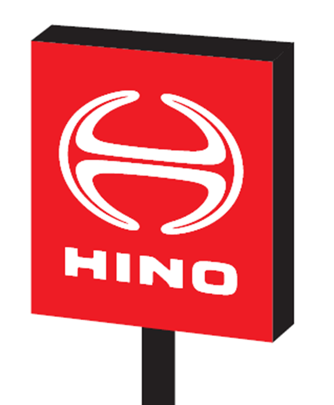
Example of signage
Example of PowerPoint template①
Example of PowerPoint template②
■ Start date
We will be carrying out a gradual transition starting Wednesday, April 1, 2026.
*Please note that there will be no changes to emblems that adorn our vehicles.
End of release